OCEAN SCHEME
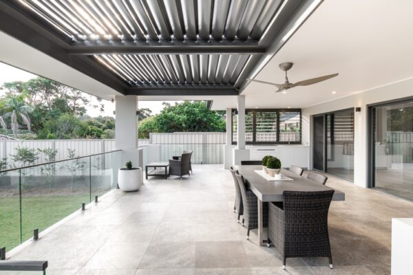
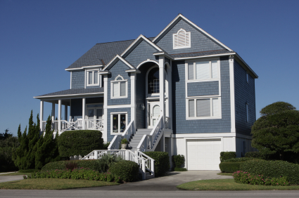
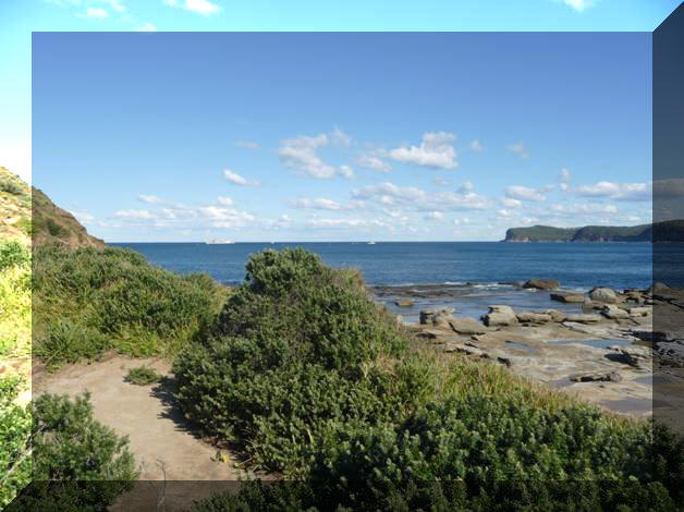
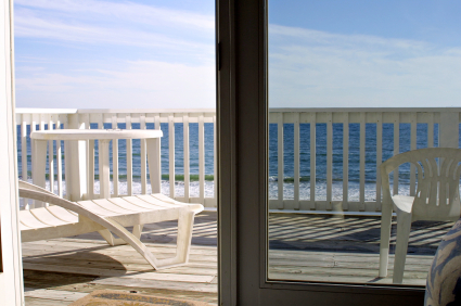
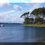
The mighty Pacific Ocean is just a stone’s throw from Rafferty’s resort and the palette of colours would not be complete without one to reflect this. The ocean at any given time contains many different hues from dark and light grey, white crested waves and of course a wonderful range of blues and greens. The main colour in this scheme is a blue that comes from the very depths of the ocean and when paired with white creates a dramatic and wonderful holiday mood. A cool grey offsets the blue well when used on the front door and upper weatherboard and gable elements and a darker grey for the deck grounds the scheme well. White painted outdoor furniture, reminiscent of the Hamptons look, would be particularly effective with this scheme. Of course, a location near the water would suit this look and ensure holidaymakers started their vacation on the right note.
For a more contemporary look then new horizontal style screens could replace the lattice work and be painted in white. If the existing latticework is to remain then it should be painted in the same smart dark grey as the deck.


The colours in the Raffertys schemes have been selected from the Dulux range. Dulux has carefully managed the colours being presented in the images to ensure they are as close as possible to the true paint colour. Colour reproduction can vary when viewing colours on your screen. Best results will be obtained on your system by setting the monitor colour temperature to 6500K, viewing the image with a subdued surround and comparing the image against colours seen in natural daylight. For full accuracy and complete satisfaction we recommend that you test your colour selection at home using Dulux Sample Pots.